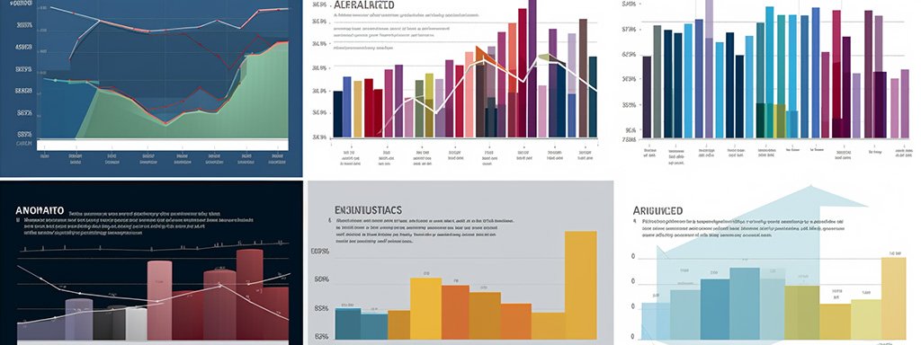
Understanding data and interpreting it effectively often involves using visualization tools. One of the most effective methods for handling and analyzing large quantities of disparate information is via stacked charts. But what exactly is a stacked chart, and how can it contribute to better data interpretation? Keep reading to find out.
Unraveling the Basics of Stacked Chart
A stacked chart is a specific type of graph in which different categories of data are represented as segments within a whole. It showcases parts of a whole composition over time or over specific categories, effectively revealing the individual contribution of each element to the total value.
This type of chart can be effectively used across several domains and industries. From finance to marketing and academic sectors, the application of stacked charts is quite extensive. Stacked charts can be an effective tool for uncovering patterns and trends across multiple data points.
The main elements of a stacked chart are vertical or horizontal bars, each section representing a specific category. The length or height of each bar amounts to a total value, providing insights into how each segment contributes to that total.
Importance of Stacked Charts in Data Visualization
One of the main advantages of stacked charts is the ease of displaying multiple data types in a single graph. This cuts down on the visual clutter and enhances the clarity of the presented data.
Individual values are shown in context to the whole, providing a broader data perspective. This is especially beneficial when dealing with data containing several complex interrelations, making the analysis more comprehensive and the decision-making process more informed.
Stacked charts can help visualize changes over time. They can display trends and patterns across multiple categories, aiding in identifying overall growth or decay. In scenarios where multiple factors influence one variable, stacked charts can immensely help detect fluctuations and correlations.
Performing Efficiency Analysis for Stacked Charts

Comparing stacked bar lengths can be a challenging task. Therefore, you might need to figure out additional ways to present the data to ensure the chart’s efficiency. Using percentage bars, building interactive charts, or using color schemes judiciously may make the visualization more comprehensible.
Pros and Cons of Using Stacked Charts
Stacked charts offer significant advantages when it comes to presenting complex data succinctly. They can help identify patterns, analyze contribution levels of individual components, and facilitate a better understanding of different data categories. However, they are not without their cons.
It can be challenging to compare individual categories, especially when the chart becomes too cluttered. Stacked charts also rely heavily on color differentiation, which can confuse certain scenarios. Moreover, they may misrepresent the data if not designed correctly.
To mitigate these issues, it’s essential to consider the complexity of the data before choosing a stacked chart. Additionally, employing proper color coding and making the chart interactive can help maintain clarity and ease of understanding.
Real-World Use Cases and Impact of Stacked Charts

The utility and impact of stacked charts can be well appreciated through their real-world applications. The finance sector extensively uses these charts to demonstrate revenue split among multiple divisions. The charts can also map out spending breakdowns, showing how funds are dispersed across various sectors and programs.
In marketing, stacked charts can illuminate the performance of different advertising channels over time, providing a cohesive picture of marketing efforts. This can greatly aid in optimizing marketing campaigns for better results.
Stacked charts are an efficient tool for data visualization, especially when the data in question involves several interrelated categories. Understanding their benefits and limitations and learning to optimize their performance can add a valuable skillset to any data-interpreting enterprise.

